I was recently playing around with some different ways of visualizing fundraiser portfolios. In development work, we often talk about portfolio management in abstract terms—capacity, engagement, pipeline health—but these concepts become much more tangible when you can see them.
The visualizations below attempt to answer a few key questions that come up regularly in portfolio reviews:
- Are we realizing the capacity in our portfolios, or is there untapped potential?
- Which prospects are going cold, and which fundraisers have the healthiest engagement patterns?
- Where should we focus our attention?
All of these use simulated data, but the patterns they reveal would apply to any major gift portfolio.
Setup
Load Libraries
Create a Sample Portfolio
Code
set.seed(42)

n_prospects <- 100
fundraisers <- c("Alvarez", "Brennan", "Chen", "Dasgupta", "Egan")

portfolio <- tibble(
  prospect_id = sprintf("P%04d", 1:n_prospects),
  fundraiser = sample(fundraisers, n_prospects, replace = TRUE),
  research_rating = round(10^runif(n_prospects, 4, 7)), # $10K–$10M, log-uniform
  largest_gift_amt = NA_real_,
  last_gift_amt = NA_real_,
  days_since_last_gift = sample(30:1500, n_prospects, replace = TRUE),
  days_since_last_activity = sample(1:400, n_prospects, replace = TRUE)
) |>
  mutate(
    # Largest gift is some realized fraction of capacity (mostly under, sometimes over)
    realized_pct     = pmin(rbeta(n(), 2, 5) * 1.2, 1.1),
    largest_gift_amt = round(research_rating * realized_pct),
    # Last gift is usually smaller than largest
    last_gift_amt    = round(largest_gift_amt * runif(n(), 0.05, 1.0))
  ) |>
  select(-realized_pct)

# Helper: tier the rating into capacity bands
portfolio <- portfolio |>
  mutate(
    capacity_tier = cut(
      research_rating,
      breaks = c(0, 1e5, 5e5, 1e6, 5e6, Inf),
      labels = c("<$100K", "$100K–500K", "$500K–1M", "$1M–5M", "$5M+")
    ),
    activity_status = case_when(
      days_since_last_activity <= 90 ~ "Active (≤90d)",
      days_since_last_activity <= 180 ~ "Warm (91–180d)",
      days_since_last_activity <= 365 ~ "Cooling (181–365d)",
      TRUE ~ "Stale (>365d)"
    ),
    activity_status = factor(activity_status,
      levels = c(
        "Active (≤90d)", "Warm (91–180d)",
        "Cooling (181–365d)", "Stale (>365d)"
      )
    )
)glimpse(portfolio)Rows: 100
Columns: 9
$ prospect_id <chr> "P0001", "P0002", "P0003", "P0004", "P0005", …
$ fundraiser <chr> "Alvarez", "Egan", "Alvarez", "Alvarez", "Bre…
$ research_rating <dbl> 1587025, 2829380, 32396, 6825917, 76010, 2800…
$ largest_gift_amt <dbl> 562210, 415276, 8338, 4267891, 33713, 9239, 9…
$ last_gift_amt <dbl> 209242, 286442, 5459, 3697335, 32057, 5500, 5…
$ days_since_last_gift <int> 1233, 897, 241, 230, 1454, 91, 1322, 1435, 11…
$ days_since_last_activity <int> 10, 121, 89, 37, 194, 163, 283, 46, 287, 347,…
$ capacity_tier <fct> $1M–5M, $1M–5M, <$100K, $5M+, <$100K, <$100K,…
$ activity_status <fct> Active (≤90d), Warm (91–180d), Active (≤90d),…Capacity vs. Realized Giving
In this plot, each dot is a prospect. Those above the diagonal line are giving above their rated capacity. Below the line, there is additional, untapped capacity. The color shows how actively the fundraiser is working the prospect.
Code
ggplot(portfolio, aes(x = research_rating, y = largest_gift_amt)) +
  geom_abline(slope = 1,
              intercept = 0,
              linetype = "dashed",
              color = "grey60") +
  geom_point(aes(color = days_since_last_activity,
                 size = last_gift_amt),
             alpha = 0.75) +
  scale_x_log10(labels = label_dollar(scale_cut = cut_short_scale())) +
  scale_y_log10(labels = label_dollar(scale_cut = cut_short_scale())) +
  scale_color_gradient(
    low = "#2d6a4f", high = "#e07a5f",
    name = "Days Since\nLast Activity"
  ) +
  scale_size_continuous(
    labels = label_dollar(scale_cut = cut_short_scale()),
    name = "Last Gift", range = c(1, 6)
  ) +
  facet_wrap(~fundraiser) +
  labs(
    title = "Capacity vs. Realized Giving, by Fundraiser",
    caption = "dashed line = parity\nbelow the line = untapped capacity.",
    x = "Research Rating (Capacity)",
    y = "Largest Gift to Date"
  ) +
  theme_minimal(base_size = 11) +
  theme(legend.position = "right")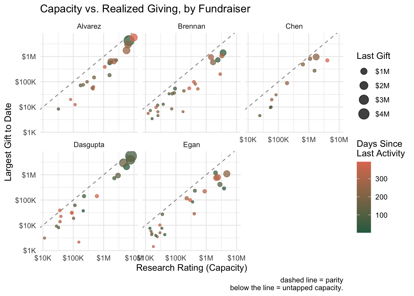
Capacity Gap Waterfall
This stacked bar chart aggregates each fundraiser’s portfolio to show the total rated capacity versus what’s been realized through giving. The coral “Remaining Capacity” segment represents the theoretical upside—prospects who haven’t yet given at their full potential.
Code
gap_summary <- portfolio |>
  group_by(fundraiser) |>
  summarise(
    total_capacity = sum(research_rating),
    realized = sum(largest_gift_amt),
    untapped = pmax(total_capacity - realized, 0),
    .groups = "drop"
  ) |>
  pivot_longer(c(realized, untapped),
    names_to = "segment", values_to = "amount"
  ) |>
  mutate(segment = factor(segment,
    levels = c("realized", "untapped"),
    labels = c(
      "Realized (Largest Gift)",
      "Remaining Capacity"
    )
  ))

ggplot(
  gap_summary,
  aes(
    x = fct_reorder(fundraiser, amount, .fun = sum),
    y = amount, fill = segment
  )
) +
  geom_col() +
  coord_flip() +
  scale_y_continuous(labels = label_dollar(scale_cut = cut_short_scale())) +
  scale_fill_manual(values = c(
    "Realized (Largest Gift)" = "#3d5a80",
    "Remaining Capacity" = "#ee6c4d"
  )) +
  labs(
    title = "Portfolio Capacity: Realized vs. Remaining",
    caption = "longer coral bars = potential capacity still on the table",
    x = NULL, y = NULL, fill = NULL
  ) +
  theme_minimal(base_size = 12) +
  theme(legend.position = "top")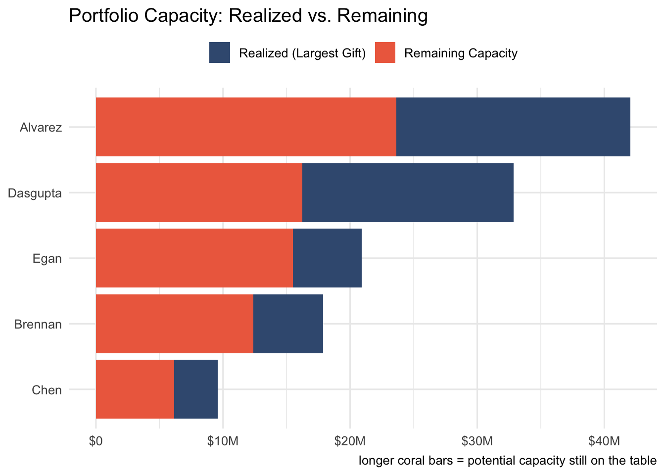
Capacity x Recency Matrix
This quadrant view cross-tabulates two dimensions: capacity (high vs. lower) and contact recency (recent vs. no recent contact). Each cell shows the count and percentage of prospects falling into that quadrant.
The goal is to have most high-capacity prospects in the “Recent Contact” column—that’s where you want to focus your energy. If a fundraiser has a lot of high-capacity prospects drifting into “No Recent Contact,” that’s a red flag worth exploring. Are those prospects unresponsive? Has the fundraiser been pulled into other priorities? Either way, it’s a conversation starter.
Code
quad_data <- portfolio |>
  mutate(
    capacity_band = ifelse(research_rating >= 1e6,
                           "≥$1M",
                           "<$1M"),
    recency_band = ifelse(days_since_last_activity <= 180,
                          "Yes",
                          "No")) |>
  count(fundraiser, capacity_band, recency_band, name = "prospects") |>
  group_by(fundraiser) |>
  mutate(pct = prospects / sum(prospects)) |>
  ungroup()

ggplot(
  quad_data,
  aes(x = recency_band,
      y = capacity_band,
      fill = pct)) +
  geom_tile(color = "white", linewidth = 1) +
  geom_text(aes(label = paste0(prospects, "\n(", percent(pct, 1), ")")),
    color = "white", fontface = "bold", size = 3.5
  ) +
  facet_wrap(~fundraiser) +
  scale_fill_gradient(
    low = "#a8dadc", high = "#1d3557",
    labels = percent_format(),
    name = "% of portfolio"
  ) +
  labs(
    title = "Portfolio Quadrants: Capacity × Recency",
    subtitle = "recent engagement = contact within 180 days",
    caption = "right-hand columns = healthy\nbottom-left = high-capacity prospects going cold",
    x = "Recent Engagement",
    y = "Capacity"
  ) +
  theme_minimal(base_size = 11) +
  theme(panel.grid = element_blank())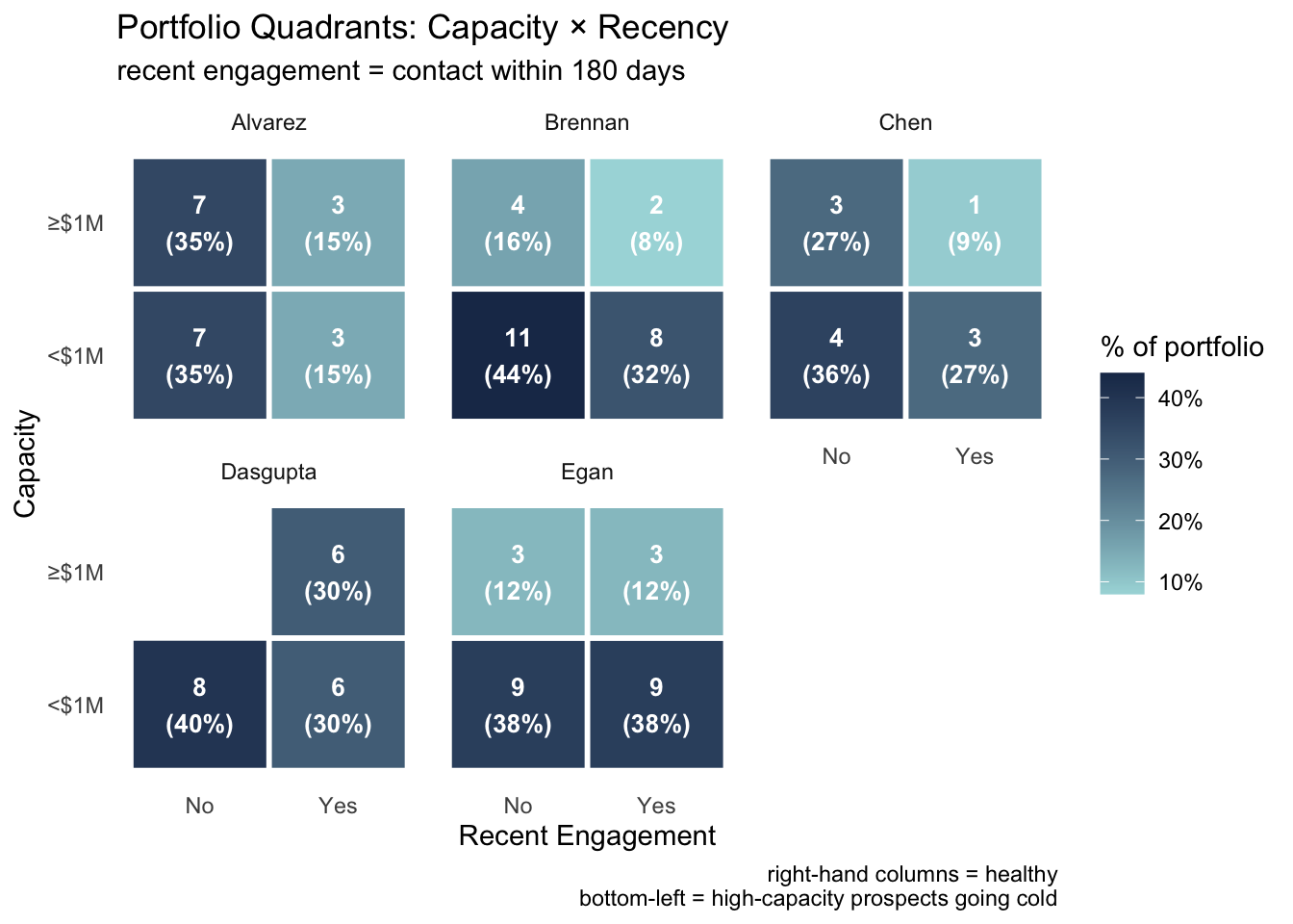
Bubble Chart
This final visualization puts every prospect on a single engagement map. The x-axis shows days since their last gift; the y-axis shows days since the last recorded activity (visit, call, email, etc.). Bubble size reflects their largest gift to date, and color indicates their capacity tier.
Prospects in the bottom-left corner are healthy: they’ve given recently and the fundraiser has been in touch. As prospects drift toward the top-right “Danger Zone,” they represent a risk—high-capacity donors who haven’t given in a while and haven’t been contacted. These are the names that should prompt immediate outreach or a candid conversation about whether they belong in an active portfolio at all.
Code
ggplot(
  portfolio,
  aes(x = days_since_last_gift, y = days_since_last_activity)
) +
  annotate("rect",
    xmin = 365, xmax = Inf, ymin = 180, ymax = Inf,
    fill = "#e07a5f", alpha = 0.12
  ) +
  annotate("text",
    x = 1450, y = 380, label = "Danger Zone",
    hjust = 1, color = "#e07a5f", fontface = "bold", size = 3.5
  ) +
  geom_point(aes(size = largest_gift_amt, color = capacity_tier),
    alpha = 0.7
  ) +
  scale_size_continuous(
    labels = label_dollar(scale_cut = cut_short_scale()),
    name = "Largest gift", range = c(2, 12)
  ) +
  scale_color_manual(
    values = c("#a8dadc", "#81b29a", "#f2cc8f", "#e07a5f", "#bc4749"),
    name = "Capacity Tier"
  ) +
  labs(
    title = "Where do prospects sit on the engagement map?",
    caption = "top-right corner = high capacity, no recent giving, no recent contact",
    x = "Days Since Last Gift",
    y = "Days Since Last Activity"
  ) +
  theme_minimal(base_size = 12)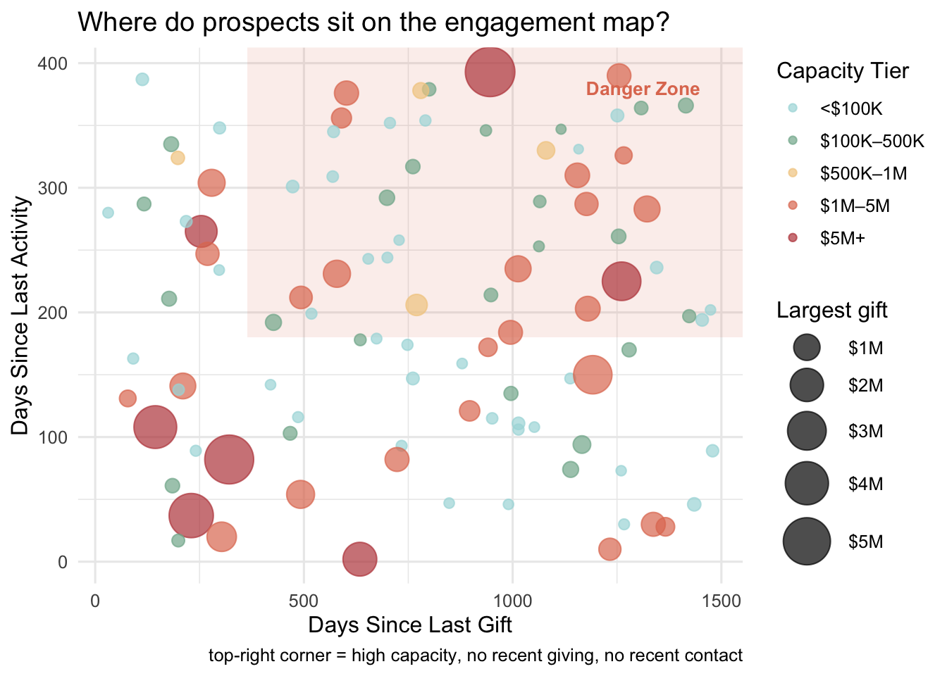
Wrapping Up
None of these charts replace the nuanced judgment that comes from knowing your donors personally. But they can surface patterns that are hard to see when you’re reviewing portfolios one spreadsheet row at a time. A quick visual check can highlight which fundraisers might need support, which prospects are slipping through the cracks, and where the real opportunity lies.