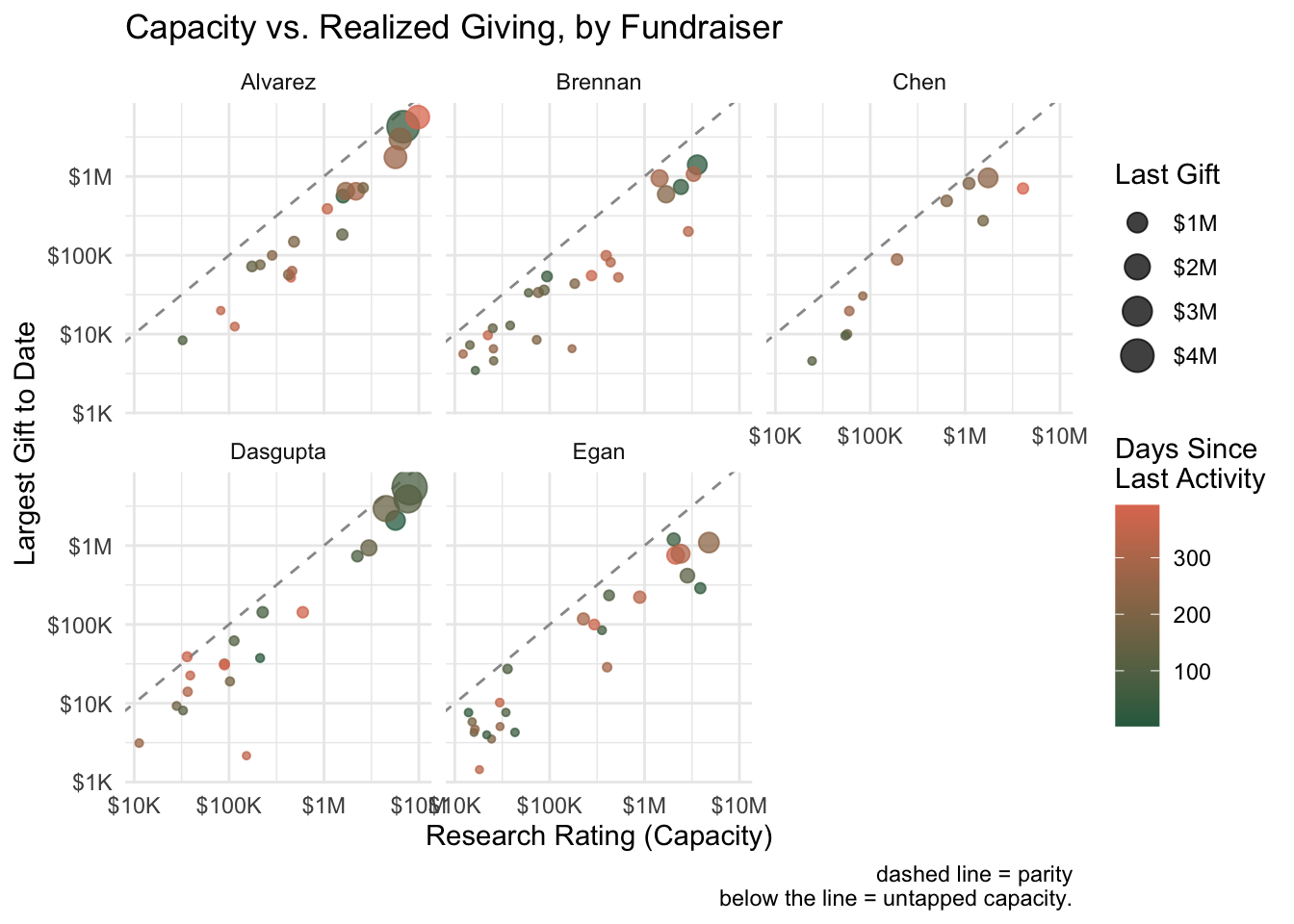
I was recently playing around with some different ways of visualizing fundraiser portfolios. In development work, we often talk about portfolio management in abstract terms—capacity, engagement, pipeline health—but these concepts become much more tangible when you can see them.
The visualizations below attempt to answer a few key questions that come up regularly in portfolio reviews:
- Are we realizing the capacity in our portfolios, or is there untapped potential?
- Which prospects are going cold, and which fundraisers have the healthiest engagement patterns?
- Where should we focus our attention?
All of these use simulated data, but the patterns they reveal would apply to any major gift portfolio.